

For 5 Years, Shreya Katuri Has Been Analysing Indian History Through Matchbox Art
- IWB Post
- March 6, 2019

For matchbox analyst Shreya Katuri, her project ‘artonabox’ started as a dissertation in the year 2013 and her Instagram page is a colourful testimony of matchbox labels.

Be it a picture of a daily object, a man/woman, or a logo, Shreya has analyzed over 2,500 matchboxes in the last five years from various countries. Her research doesn’t stop there because till now her focus was to decipher the meaning of art on matchboxes and by taking her project to the next level she desires to get an in-depth knowledge of the other elements of this art.
Excerpts from an interview:
Tell us how you came up with the idea of analyzing matchboxes and what led to the formation of ‘artonabox’?
This project started during my undergraduate degree in journalism and as part of a dissertation I wanted to do something different with my knowledge in media and culture, which is a sociology subject that I took as an elective. So with that as a background, I decided to study matchboxes from a sociological perspective. I deconstructed the matchboxes by using three domains as a focus to analyze them in relation to the Indian framework, which were religion, gender, and nation.
It took about a year of research work to complete my dissertation for which I got good reviews and that’s when I realised that why should I stop working on it and this knowledge should be shared with people who might find it interesting. Also, I have been very active on social media and especially Instagram which has a lot of design enthusiasts, so I thought I will give this a chance and share my work with people. That’s how ‘artonabox’ came into form and through it I have interacted with a lot of people who have shown interest in this work.
How many matchboxes have you analyzed till now and what have you inferred from them?
Well, I have analyzed about 2500 matchboxes till now and they are not only from India but from around the world. After studying the matchboxes in India, I found out that there has been a constant effort in using religious symbols in the form of a divine iconography and they have adopted a path that is biased in nature by majorly printing pictures of Hindu gods, goddesses, and other symbols like Om, Swastika, Kundli etc. related to the culture, that ends up having implications in which ‘religion’ on a national level takes the shape of a Hindu majoritarian definition. So the ideas and definition of religion have coalesced into what is now being identified as a national identity.
It initially started out with cartographic representations of the female deity i.e. Bharat Mata, invoking nationalist sentiments before the Independence movement and it was being used across various media texts to embody the spirit of nationalism. Her image also accompanied other symbols like the lion, lotus and the tricolor flag.
Apart from that, with the entry of liberalisation in the ’90s, match labels changed in terms of imagery by having images of consumer products like logos and brands which showed a sense of pride in identifying oneself with their country. Thirdly in terms of gender representation, I observed it is marked by dominant streaks of a patriarchal discourse, where both men and women have been objectified. For example, femininity was being defined through three ways by portraying woman as a bride, or they were shown wearing traditional clothes, and in a complete contrast they were shown wearing western clothes with the added characteristic of the woman hinting at the cleavage. So, all these factors aimed at showing women as objects and normalized the ‘male gaze.’ Similarly, men were shown as warriors, heroes, ambitious professionals (cricketers, farmers, doctors) and protectors of the nation, conveying to us that these qualities define ‘masculinity’.
Was this artwork used by people to convey a message?
My idea behind the project was to classify the objects on the matchboxes in different categories and to find out the underlying text to it. So of what I have inferred from analyzing the matchboxes was that the images on them were classified into two categories back then. One category had pictures of things that people could relate to which they saw in their surroundings so you would find a picture of a bat, an apple or a cat. And these pictures were made in small factories in the villages which were drawn by hand. The other category showcased the aspirations of people by portraying pictures of a radio set or a table fan which were products of luxury.
But I feel that there might have been a bit of messaging going through these matchboxes probably during the independence movement and it was interesting to see the dominant messages (Bharat Mata) going through it, as I mentioned earlier.
How have the illustrations on matchboxes evolved over the years?
One factor in terms of designing is that previously the illustrations were hand drawn and now they are printed, but in terms of the picturization, back then you would find images of a Ship or a Maruti car and now we have images of a Tata Nano or an Esteem car. So the pictures on the boxes depict that they had a socio-cultural and economic aspect to it. As for now a lot of brands like Microsoft, Apple, and Kingfisher feature on the matchboxes that show how technology is progressing.
Secondly, in terms of gender portrayal, there hasn’t been much of a difference in the way women are presented because they are still being shown in a certain way. There was only one label that I came across that had P.T. Usha on it which was the only exception; otherwise, you will always find a picture of a bride or a Bollywood celebrity wearing skimpy clothes. There is a lot of objectification going on and the definition of how women are portrayed hasn’t changed over the years.
As you shared, a woman’s body is always seen in a certain light. How can we change that image?
Well at my level I can only challenge the thinking by questioning people through my project and it is a subject that I am working on. But in terms of changing the definition of the portrayal of images of women through matchbox art, we need to present pictures of women as farmers, teachers or as an astronaut because there are so many inspirational women out there who are doing exceptional work in various fields.
You mentioned that you have a collection of matchboxes from many countries. Did you find any difference in the pattern?
Oh yes, there is definitely a big difference in the pattern of matchboxes from various countries. The maximum number of matchboxes that I have collected are from the US and India. In the US it’s not easy to find them at every two or three feet because people over there mostly use lighters. So the boxes that I found were from bars or restaurants. From the aspect of design, they are very minimal and are more brand oriented as compared to India. You will usually find restaurant logos on it and nothing casual. Also in terms of colour they are not very bright. However, one of the most differentiating aspect I found out was that in the US matchboxes played an important role as a tool for advertising in the American history for printing companies, hotels, and restaurants specifically in the period between the ’60s and ’80s, whereas in India, this art was mostly used to invoke the sentiments of nationalism during the independence movement.
As for the other countries I have only studied a few matchboxes till now and I wouldn’t make a generalized statement, but I found out that Sweden was a huge manufacturer of matchboxes and their aesthetics were quite different.
As a collector, what has been your most favourite theme and what element of this art intrigues you the most?
My favourite theme has been analyzing the logos and brands on matchboxes. There have been a lot of new brands that have come up as compared to the 90s so studying that difference is amusing to me. There are brands like Kingfisher Ultra, Microsoft, and Apple that have gained popularity and there are also images of Cinderella or Chota Bheem that feature on the boxes and they are really interesting to see.
The elements that catch my attention are the colours and the icons on the matchboxes. I have figured that predominately red, yellow and orange colours have been used as a pattern through all these years. I haven’t been able to study the choice of colours in detail yet but there could be many reasons for it. Maybe this has something to do with the icon or this is the choice of colour for the designers who have decided to stay with it or it could even be that these colours are indicative of fire as a theme.
If given a chance, what message would you like to share through this art?
I would love to change the current images of women by portraying pictures of renowned women in this art with a brief description of their work that helps to change the notion of society and empowers them.
What’s next in store for ‘artonabox’?
I am currently playing with new ideas to present my work in a different form in terms of the content and the way I analyze them by concentrating on the typography now. And I am even planning to build a website where everything can be archived in one place. Also, I am open to collaborations with people since many of them have shown an interest in this space and I would love to work them.
First published on Dec 24, 2018.
- 0
- 0

Related Stories
-
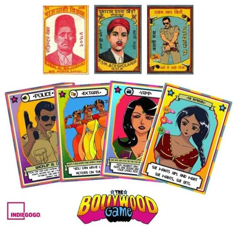
 READ MOREArt & Culture
How Giving Birth To A Daughter Made Author Sh...
-
 READ MOREArt & Culture
Lady Kash, The First Tamil-English Female Rap...
-
 READ MOREArt & Culture
Healing Communal Tensions, Dastangoi Is A Cul...
-
 READ MOREArt & Culture
Art Curator Sitara Chowfla On Reviving The Go...
-
 READ MOREArt & Culture
Meanka Handu On Her Channel Asvun Koshur And ...
-
 READ MOREArt & Culture
India’s First Female Rap Duo Speaks Up For ...
-
-
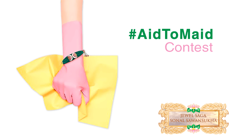
JWB along with the brand Jewel Saga bring you a selfie contest inspired by the campaign AidToMaid.
